Lily is a creative lead who specializes in brand design, art direction, and illustration. She loves balancing strategy with play.


-
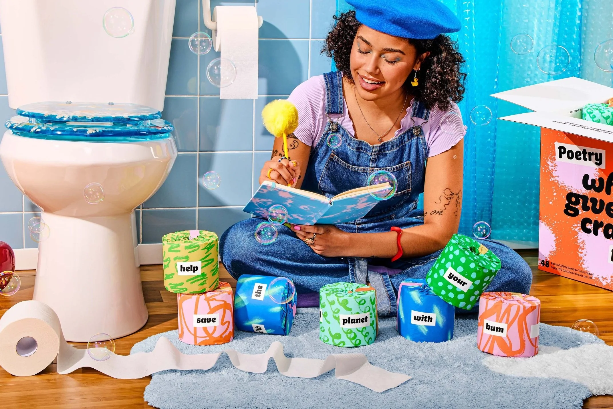
![A poet in a bathroom with playful toilet paper rolls]()
The Poetry Edition
Packaging design and campaign art direction for limited edition toilet paper inspired by magnetic fridge poetry
-
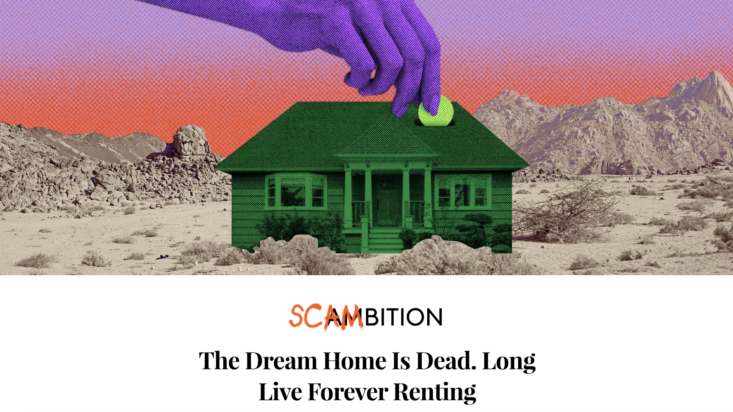
![]()
Scambition Editorial Series
Branding, art direction, and artwork for this Refinery29 series on millennial frustration
-
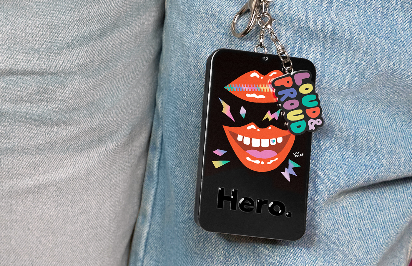
![]()
Hero Cosmetics Pride Patch Tin
Illustration for a limited edition, gift-with-purchase pimple patch case in celebration of Pride month
-
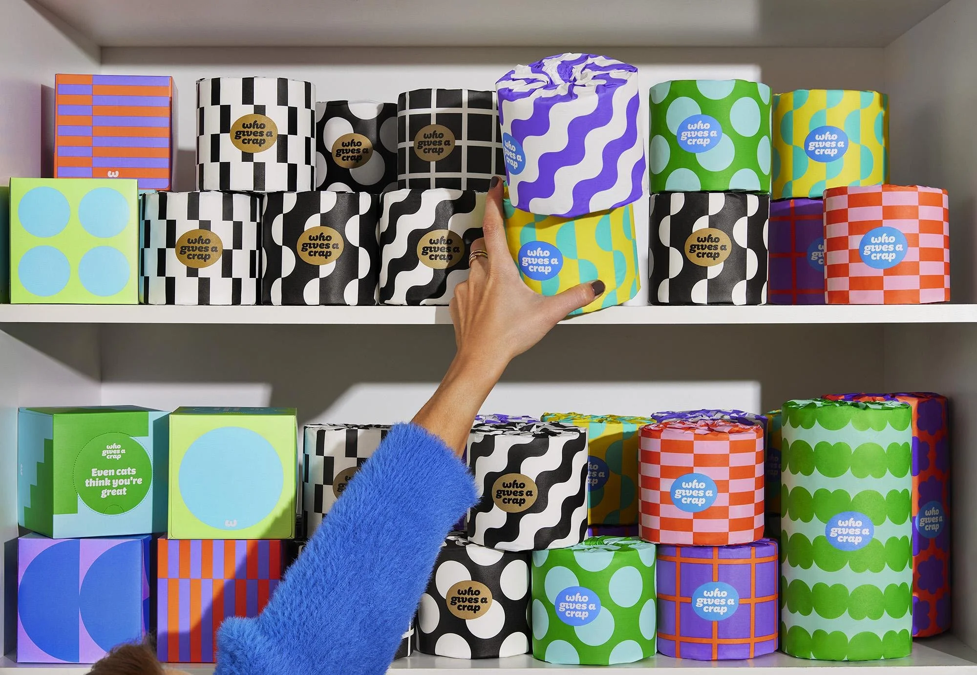
![]()
Who Gives A Crap Packaging Refresh
Packaging design and systems thinking for Who Gives A Crap
-
![a tween holding a pair of period underwear on a colorful set]()
Mint Chip
Art direction for a campaign shoot announcing a new colorway for Thinx’s teen period underwear line
-
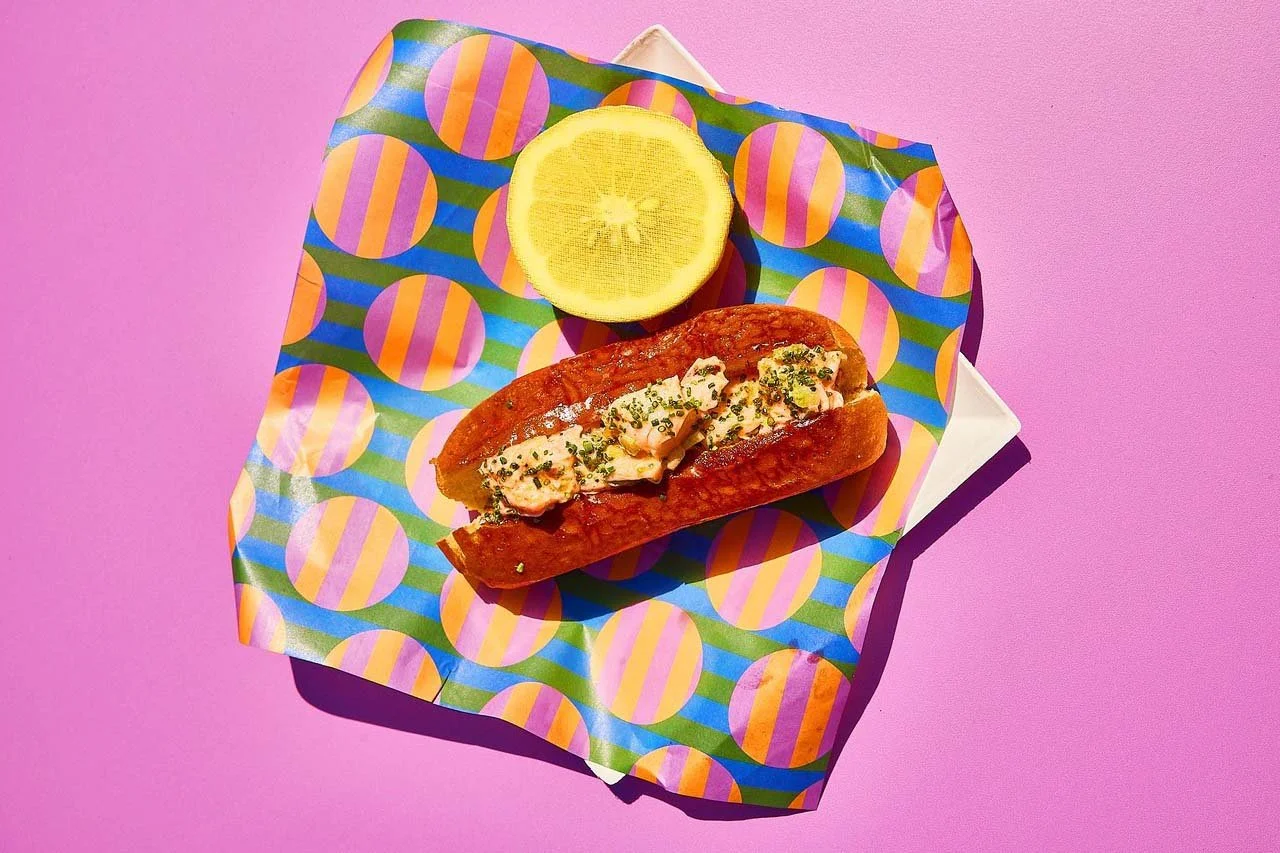
![A lobster roll on a patterned paper]()
The Boardwalk
Pattern design and branding for an Amex X Resy pop-up event
-
![]()
Illustration
Editorial, commercial, and personal illustration


About
Hi, I’m Lily. I live in Chicago with my partner and chihuahua. When I’m not directing campaigns or bringing creative concepts to life, I enjoy thrifting, painting, and jumping into Lake Michigan. While I work with brands big and small, I love collaborating with queer, minority, and women-owned businesses, as well as mission-driven businesses that make a difference. I’m all about clear communication, unexpected delight, and designing for good. Let’s get to work!
Skills
Brand strategy
Competitor analysis
Mood boarding
Strategic thinking
Project management
Communication
Hand lettering
Painting
Sketching and thumbnails
Surface pattern design
Prop, set, wardrobe styling
Content creation
Product rendering
Image retouching
Services
Graphic design
Logo design
Brand identity
Art direction
Illustration
Photography direction
Social media templates
Presentation design
Emails and marketing assets
Print collateral
Packaging
Clients
Refinery29
Thinx
Who Gives A Crap
Ban.do
Society6
Lokai
Clamor Media
Hubspot
Amex X Resy